


And.co isn't bland.co
Tearing down AND.CO's welcome email...
Hey all!
I’m back with a new welcome email teardown. In a slightly different guise this time, as the more eagle-eyed among you might have noticed.
But don’t worry, it’s still me. And I’m still gonna tear down welcome emails.
This week, it’s AND.CO. An all-in-one platform for freelancers and small businesses. It offers a lot of different features and so I was curious to see how they’d handle this when it came to their welcome email.
I’m pleased to say, it’s one of the best welcome emails I’ve seen. So let’s dig in…

First up, as always, the subject line. It welcomes me to the product like virtually every other welcome email. Where it differs, however, is that it tells me it’ll make my life easier.
Who doesn’t want that? This will definitely increase open rates and engagement.
As for the sender, it’s from “Jodi from AND.CO”. Using a name is great, and including the company helps me know what’s going on.
So let’s look at the email.
Notice that first line. Specifically the part in bold. They’ve told me that thousands of other freelancers are using AND.CO. How’s that for social proof!
They’ve also included a brief overview of why the product is so useful in the first place.

Then there’s this graphic. Sure, it looks nice. But it doesn’t actually provide any value whatsoever. It’s just taking up valuable email space. A better alternative would be to embed a video or GIF of the product in action.
After the image, there’s another reminder of the core features that AND.CO offers. Listing them out like this is clear and shows me why I chose to try out the product in the first place. It gets me excited about using it.
And then the CTA. It’s clear. It’s an obvious next step in the user journey. I know exactly what I need to do, and I can click that button to do it. That, ladies and gentlemen, is exactly what a welcome email CTA should be.
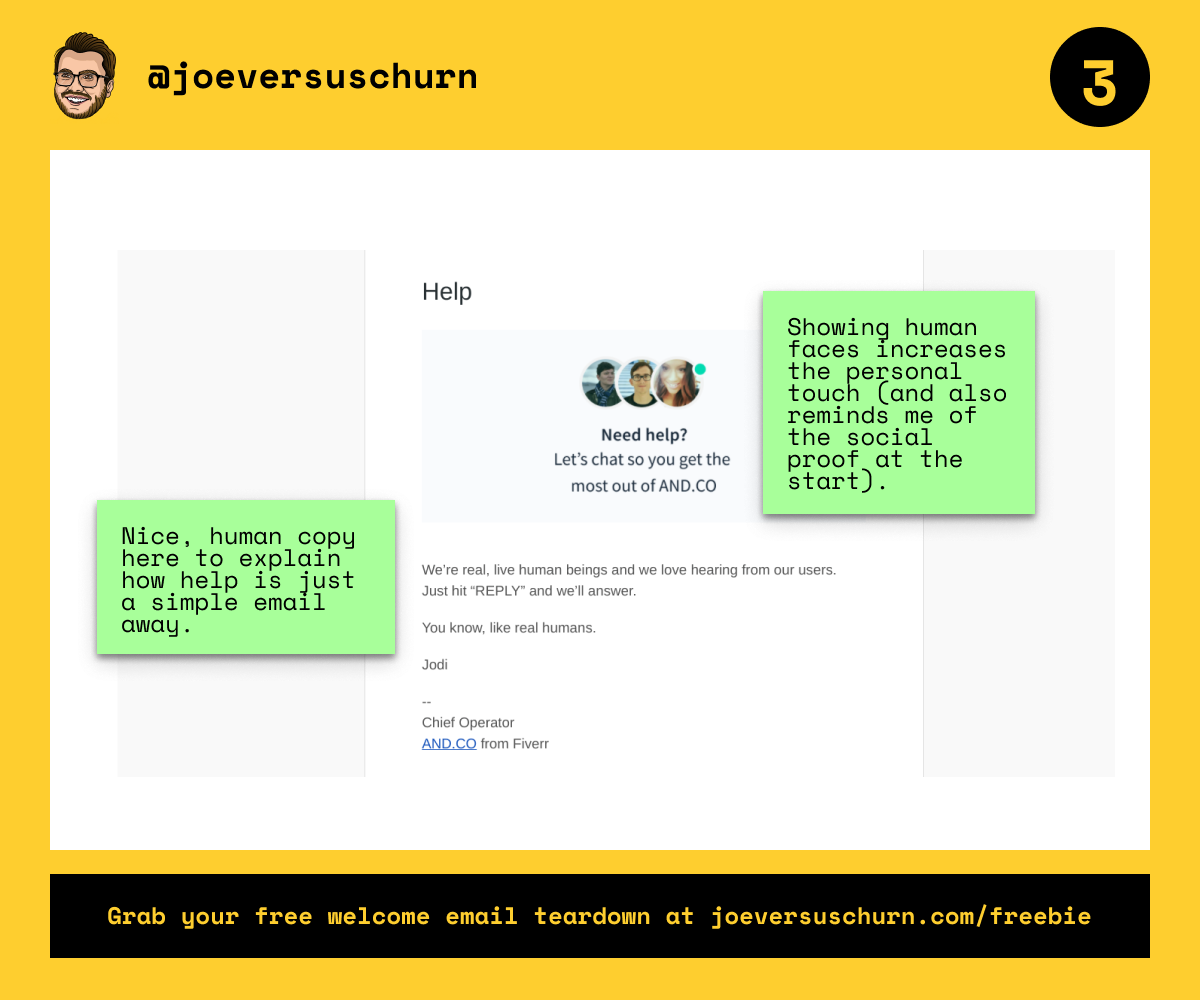
Below the CTA, almost in a postscript, is a little section on how to get help if and when I need it.
Showing human faces like this adds more of a personal touch. It also harks back to the social proof we saw at the start.
They’re sure to tell me that they’re human beings (great!) and that all I need to do is hit reply to get a response.
So yeah. Congrats to AND.CO because there’s barely any room for improvement here.
That’s all from me this week! Thanks so much for your support! If you could share this with any colleagues, friends, maybe even arch-enemies I’d really appreciate it!
Until next time,
Joe