


This welcome email is Hot(jar) 🔥
Tearing down Hotjar's welcome email...
Hey there!
Today I’m going to be taking a look at Hotjar’s welcome email. If you didn’t know, Hotjar allows you to basically spy on your site’s visitors with heatmaps, recordings, and more.
I still get a weird thrill when I watch a recording of someone interacting with my site. Is that creepy? It’s probably creepy. Let’s move on.

First up, the subject line. The good news? Hotjar haven’t opted for your standard “Welcome to Hotjar” subject line. The bad news? Their version might be even worse. Why bother telling me this is the first email? I know that. It’s a waste of a subject line, it’s not engaging, and doesn’t make me want to open the email.
The email is sent from Hotjar’s support email address, simply using the name Hotjar. It would be nicer if this was sent from a person. Alison, maybe? (That name will make more sense in a minute.)
You’ll also notice there’s no copy above the fold. The first and only thing I see when I open this email is a large graphic that doesn’t tell me much at all. I’m all for showing off the product, but this image needs to go further down the email. Lead with copy.
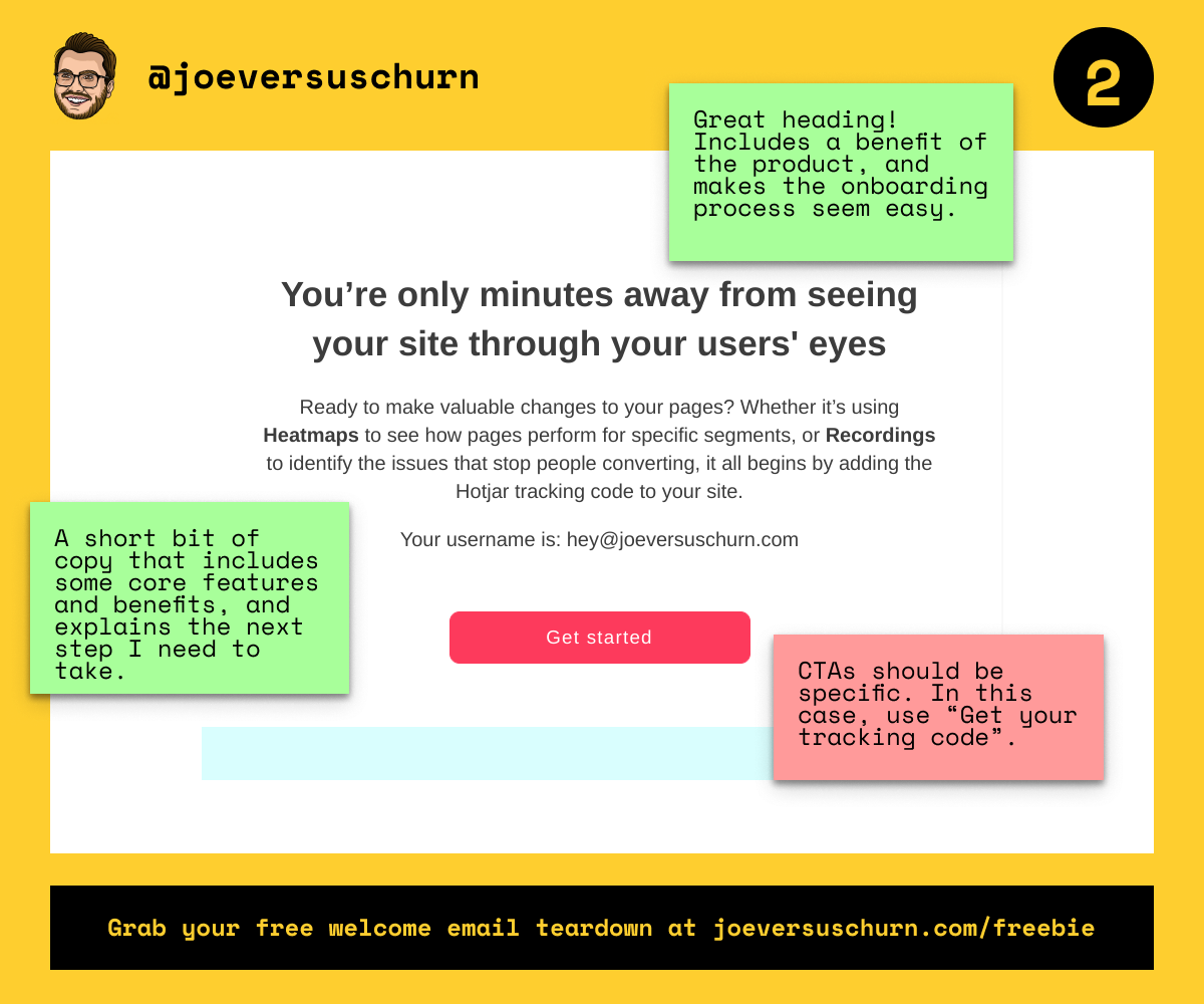
The header is great. It includes a benefit of using Hotjar, and saying “minutes away” suggests the onboarding process is straightforward and takes no time at all. Perfect. Put this above the image at the top and I’m fully engaged.
The copy underneath is also great. It mentions some core features and benefits, helping me remember why I signed up in the first place. But it also ends by explaining the next step I should take. I know exactly what I need to do next.
The CTA is very generic, however. It pays to be specific. Here, for example, Hotjar could use: “Get your tracking code”. This tells me exactly what will happen when I click the button. And I already know that’s the next step I need to take. So clearly I’m going to press it.

Hotjar have opted to include extra info under the CTA. This is smart. If I want to get started with the product, I can click the CTA and move on. If I need extra support, then the info I need is here.
The email now introduces Alison. Adding a photo of Alison is a clever way of building a personal connection. I’m now conversing with Alison, not Hotjar. That’s much better. (Though part of me thinks Alison should introduce herself at the start of the email.)
The final section contains a list of links to various resources. This is a clear way of laying them out. I can glance at the list and see if anything there will help me right now.
Overall, Hotjar’s email starts off badly and then turns it around in the second half. It’s the comeback kid of emails.
Hope you found this useful. As usual, I’d really appreciate you sharing it with anyone else you think would be interested! And if you want me to tear down your own welcome email, then all you need to do is ask!
Until next time,
Joe